Indiegogo: Brand Strategy
Indiegogo, one of the world’s largest crowdfunding platforms, tapped PUSH Offices for the design and execution of their rebrand.
Strategically, Indiegogo is the most open and customer-focused crowdfunding platform. Indiegogo campaigners have created award-winning documentary films, brought relief to refugee camps, put students through college, sent bands on global tours, and helped inventors bring their ideas to life.
So how could an identity system express the emotions, promises, and personality of this special company? A place where anyone from anywhere can do anything?
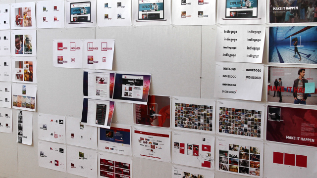
Our design solution put the Indiegogo community at the heart of the identity. We created a flexible system to foreground these customer successes.
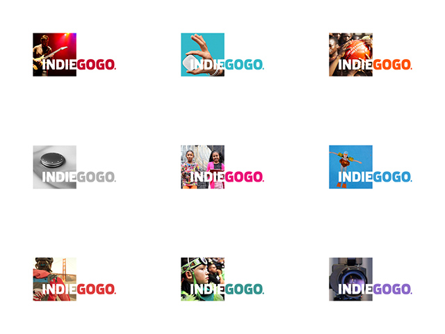
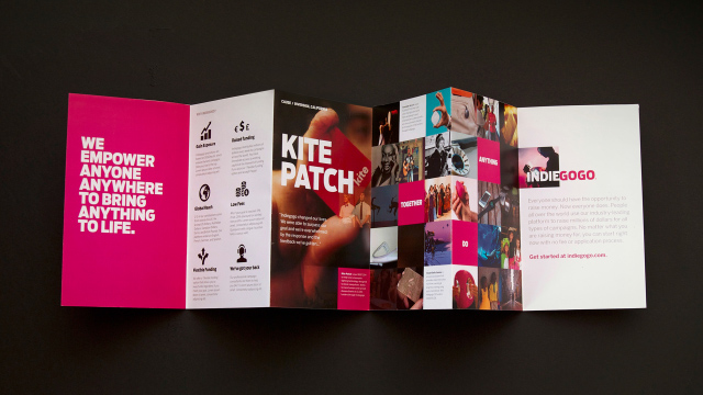
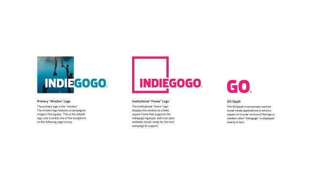
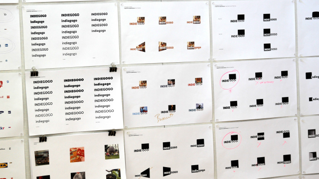
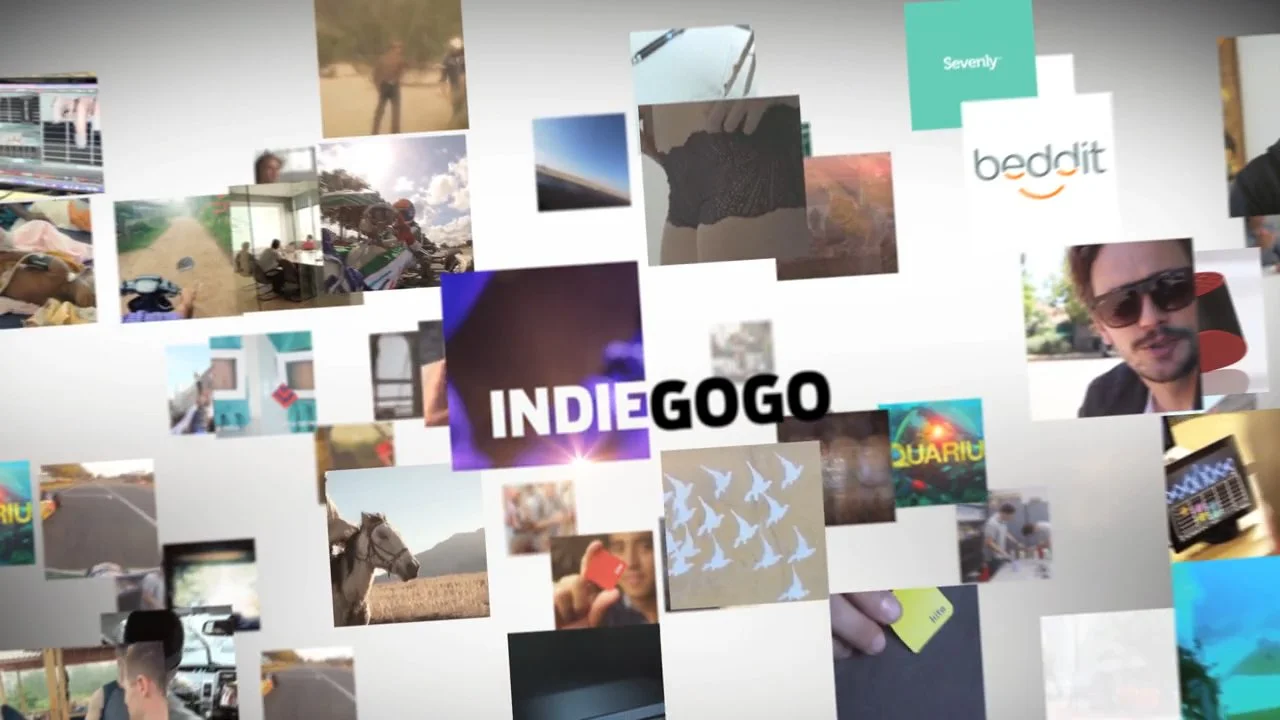
The new Indiegogo logo is fluid, evolving, and dynamic. A radical departure from traditional identity systems, which are fixed, rigid and precious, and arguably more interesting and meaningful than the logos of contemporary global brands.
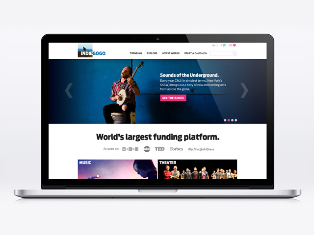
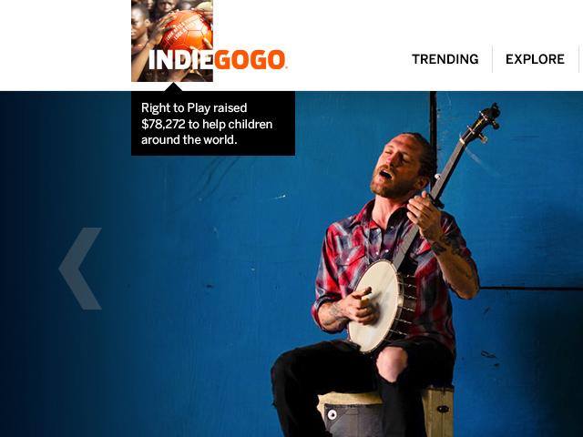
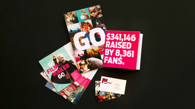
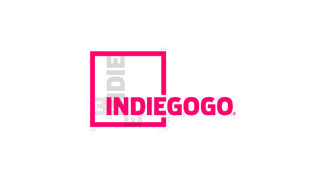
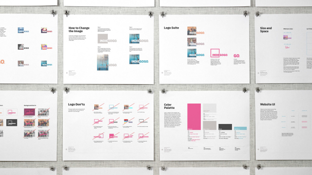
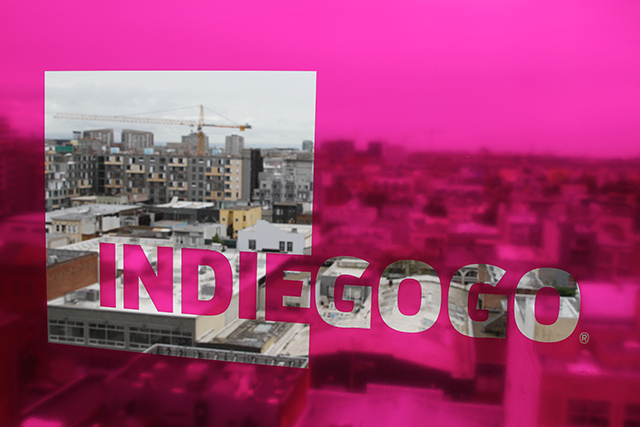
The core of the identity, the Indiegogo logo, places a different campaign image within the frame of the logo. There are endless variations, each telling a different campaign story. On the website, a different logo is shown on every page, every day.
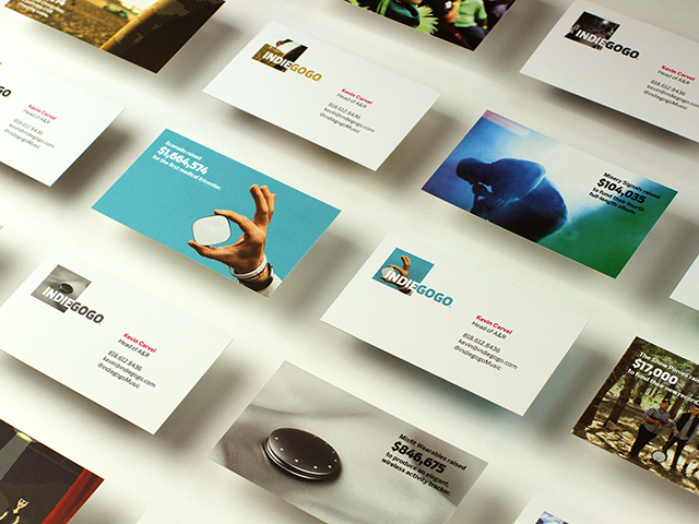
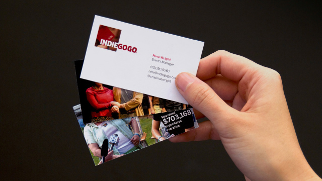
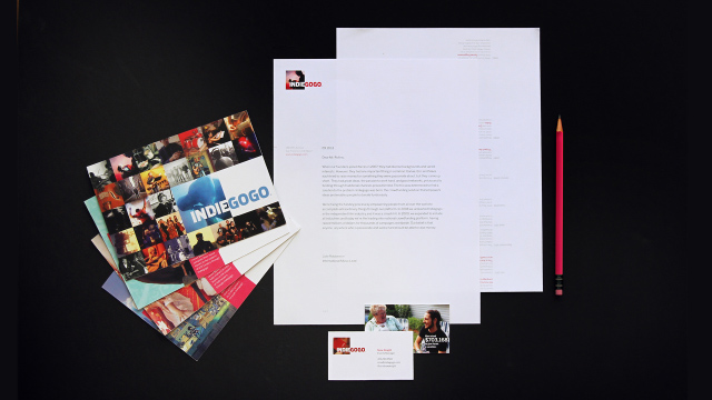
We redesigned the business cards as pocket-sized case studies for successful campaigns, which when flipped over have employee contact information on them. Every new employee gets a stack – almost like crowdfunding trading cards, each with a different mini-case study on the back.
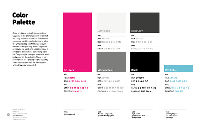
Indiegogo needed to “own” a color from a brand perspective. Doing a survey of the competitive landscape, we saw an opportunity for Indiegogo to use a signature color to differentiate the identity from the rest of the crowdfunding landscape. We call Indiegogo’s new primary color “GOgenta.”
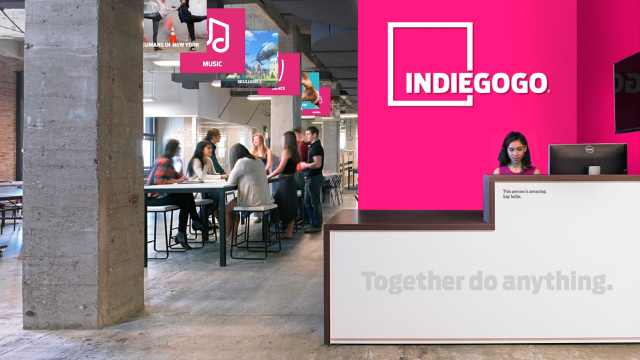
The new brand identity is a window into people’s hopes and dreams.
The new identity puts the Indiegogo community at the center of the conversation. People are the heart and soul of the brand. In essence, the logo becomes a window. A window into past successful campaigns and a window into the future for aspiring campaigners who wish to launch a crowdfunding project.
The new identity is active.
The new identity embraces a world that is always changing, embodied in the way the type reacts to the local color in the photo. The color of the logotype matches the dominant thematic hue of the campaign image.
The new brand identity is always now.
Indiegogo campaigns are funded every minute. The logo changes with every visit, on every page. The logo reflects the dynamic nature of crowdfunding, ensuring that the Indiegogo brand identity of today is continually evolving into the Indiegogo of the future.
A new brand video was also written, directed, and produced by PUSH Offices.
Roles: Creative Direction